Everyone learns about the color wheel, but there’s actually many color wheels, and they’re ALL wrong! Well, depending on what you’re using the color wheel for they are. What I’m really interested in is the idea of opposite or complimentary colors.
Complimentary colors are the colors that sit opposite one another on the color wheel and it’s said a color’s compliment produces the most visually appealing contrast. It’s treated almost as a scientific law by many that every color only has one compliment and that the compliment color is the best choice to contrast the base color. I’ve got some problems with this.
Is there really only one compliment per color?
It might seem silly to question this. Of course there’s only 1 complimentary color, there’s only one color opposite any other color on the color wheel. But one issue there is that there are multiple color wheels! And each one gives you a different complimentary color. Which one is right?
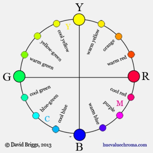
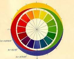
The most popular color wheels are the traditional artist’s RYB color wheel, which uses Red, Yellow, and Blue as its primaries, and the more modern RGB color wheel which uses Red, Green, and Blue as its primaries.
The RYB wheel is what everyone learns in elementary school so most people are familiar with the primary compliment pairs Blue/Orange, Red/Green, and Yellow/Purple. Seeing it on the RYB wheel like that makes it seem like an irrefutable fact of reality, so it becomes pretty intuitive for most people and they’re typically pretty confused to see the alternative color theory “rules” given by the RGB model. The RGB wheel gives you the primary compliment pairs Blue/Yellow, Red/Cyan, Green/Magenta. What happened to orange and purple? Orange is opposite to a more Azure blue and Purple is across from Lime Green.
Which wheel is the right one when choosing our complimentary colors? RGB-bros like to point out that RGB is the more accurate model scientifically. The compliments in RGB perfectly cancel each other out to white when mixed additively (or black subtractively), whereas in RYB the compliments mix to create some muddy brown because the wheel is unbalanced (The RYB primaries create a much smaller gamut than RGB so it ends up not even being able in include brighter colors like cyan and magenta). However, RYB-heads (usually traditional artists) may argue that their model matches our subjective human color intuitions better by cleanly separating the wheel in half into the warm colors and cool colors. This is kinda a cope since the RYB wheel wasn’t developed with this aim in mind. What if we had a color wheel that was more based on our human perception of color, rather than other validating measures of correctness like how the complimentary colors cancel out.
The best wheel of them all?
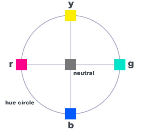
Introducing the Opponent Process Model, or the RYGB Wheel. It started out as just a hypothesis, but there’s now scientific evidence that the brain sees 4 unique hues, Red, Yellow, Green, and Blue, and that all other colors are generated by comparing the Redness vs Greenness of a color, and the Blueness vs Yellowness of the color. Thus, these 4 colors act as primary colors which all other colors are psychologically combinations of. With this color wheel, you get the compliments Blue/Yellow and Red/Green (each of these which appear on the RGB and RYB wheels respectively). I have to say, these colors being the “psychological primaries” is pretty compelling and feels intuitive, it has both a scientific foundation and also matches our subjective perceptual . . . . .
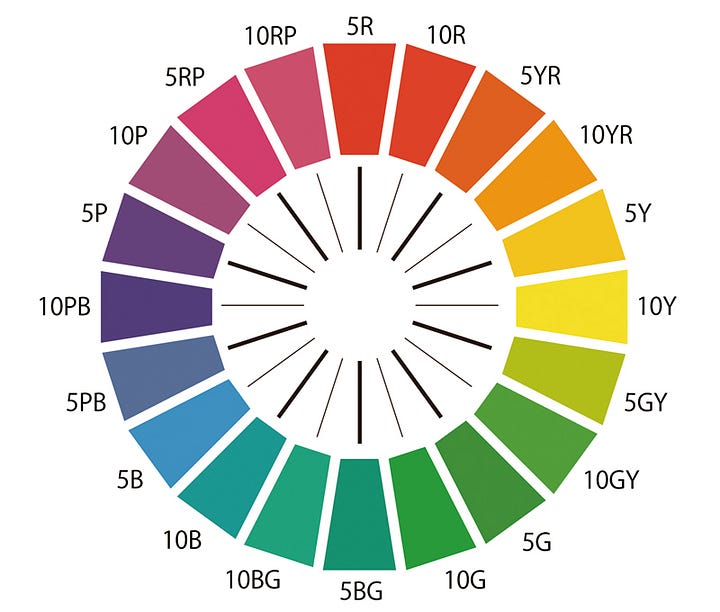
This article is already too long so I won’t continue glazing this. Fuck this model (respectfully). The opponent process model is pretty iffy, there’s a lot of contention around what exactly these 4 unique hues are and you’ll get wheels that have the red look more like a magenta-red or the blue look closer to purple or cyan, or the green looking like an aqua. There’s no consistency! Then there are more models, like the Munsell hue circle which, like both RGB and Opponent Process, have enough validating measures to claim a level of superiority in some department*.


Embracing Full Subjectivity
Look, each of these models are the best for something. I want a model that is best specifically for understanding complimentary colors artistically. And since art is subjective, I’m saying fuck any “objective” measures for this model. I’ll make my own model and I’m going with my gut. Truthfully, I started on this journey because I felt in my gut, purely based on vibes and intuition, no scientific models, that the opposite of blue should be red, and absolutely NO color wheel supports this. And other people seemed to agree with this! When I polled people, the majority of people said that they felt like the opposite of blue is red. Perhaps the collective human gut is aligned.
There was similar agreement when I asked the opposite of green, the highest vote going to purple, which is another complimentary pair that isn’t represented in any color wheel. These vibe based color compliments aren’t completely arbitrary, it’s is an internal model of color in us that isn’t based on wavelengths or trichromatic color vision, or the opponent processing of some retinal ganglion cells. It’s based on MEANING, which is the most important metric when dealing with art as far as I’m concerned. People explained their reasonings like “blue represents calm and red represents aggressive”, or “green is good, red is bad”. Though if I used both of those, red would have two opposites, green and blue . . . . .
Fuck it, who says a color needs one compliment anyway? I initially wanted to have a model that would still map colors one to one, but to accommodate the range of feelings people have expressed, I will have to allow this one to many, or even many to many system. We’re embracing full subjectivity here, because it’s in this complicated subjective experiential realm where the real truth can be found. I call it the 4 Quadrants Model (I thought of the name and the final representation of the model while writing this lol).
My Model
Originally I had it so I’d have the pairs Blue/Red, Orange/Azure, Yellow/Cyan specifically. That blue/red is what I really wanted. These pairs make sense to me because I think blue is a very passive and watery color while red is an aggressive and fiery color. In art I think they produce the most emotional contrast together. They’re opposites emotionally and thematically! Yellow is warm, cyan is cold. Orange and Azure, well, they’re both in between red and yellow, and blue and cyan respectively, so I felt it was right to put them together. I may have come up with orange is experimental and azure is safe.
But other people had similar justifications for different color pairs. I heard yellow is warm and blue is cold, instead of cyan. And I could come up with alternatives to my own. Red is fire and cyan is ice. So I figured, I’ll lump all the reds, oranges, and yellows into just the Oranges, and all the blues together in the Blues (they’re already colloquially considered all shades of blue, it’s blue, azure, and cyan). The basic contrast is warm/cool. The colors aren’t paired one to one in these groups anymore, the way I see it, any color in the blues is complimentary to any color in the oranges. It depends on what specific flavor of the contrast you want. For an intense negative conflict with blue, I would choose red, but for a brighter, more positive contrast, I would go with yellow. The ends of each group is kind of like an opposite themselves, but within the group. So in the warm side, you have red, angry, aggressive, deadly - and you have yellow, warm, cozy, sunlight, happy, cheerful.
One of the compliment pairs are the warm oranges vs the cool blues. The other pair are the greens vs purples. I think these colors are neither cool nor warm, they’re more neutral, which is different than what the traditional RYB system claims which puts them both in cool with blue. For me personally, the contrast is green represents life and the natural, whereas purple represents death and the supernatural, or the mystical. You can see this contrast in the real word where natural life all around us is green, and purple is a rather rare color in nature. In fact, these intuitive color pairs are largely based on our experiences of the world, which is why I think it’s important to try to capture that in a model.
The main pairs are now Orange/Blue, Green/Purple. These pairs can be nicely viewed on the RGB color wheel where the 4 quadrants become clearer.
Magenta takes up a much larger portion of the “purple” quadrant here than in my model but that’s whatever. Perhaps I could have come up with a better visualization but I’m getting exhausted writing this, time to wrap it up.
Conclusion
Basically, I just wanted a model that will validate my personal feelings that blue is the opposite of red, and green is the opposite of purple. And because I was basing it off of my gut, I felt it wasn’t fair to leave out other people’s gut feelings. To accommodate, I ended up basically just splitting the normal color wheel into 4 and saying these groups of colors are opposites now instead of these individual hues. So was this whole endeavor kind a massive waste of time… maybe? Also, I just noticed that I don’t need to say 4 quadrants, cuz quadrant already implies the area is split into 4. But that’s ok, this place is for me to ramble about undercooked thoughts. So yea, this was pretty undercooked.
I was also sick and tired of people who claim to be knowledgeable about color theory try to make it a rule that one color is objectively the complimentary color of another and analyze art through that very restrictive lens. So if anything, at least I challenged that idea.
I suppose as a final note: Art is subjective, and our experience of reality isn’t logical, especially color, so don’t get stuck threating color theory as color law.
Edit (1-31-25)
Somebody pointed out something to me that should have been quite obvious! My system is basically taking the color spectrum and marking green as the center in which opposites are reflected over. On the color spectrum (rather than a color wheel), red and blue are on opposite sides, yellow and cyan are closer to the center but also opposites, and green is in the center, being the opposite of purple which isn’t actually part of the linear color spectrum!
Additionally, I found this neat graphic which in some way captures the essence of my model. Instead of a color wheel, it’s a color square, with my opposites being across vertically, and with purple and green opposing horizontally.


